Showing posts with label design. Show all posts

Friday, 22 May 2015

A Work In Progress

It's been a busy few weeks in the studio as I'm getting the new Spring-Summer collection together. I would have shared the new prints with you sooner but my laptop decided at this most crucial moment to pack up completely.
Sadly this means you'll have to make do with some not so great photos taken on my phone, rest assured there will be better pictures soon!

From front to back; Milla,  Maddsie,  Thorpe, Meadow,  Mitsi.
All shown here as the reef knot tab bracelet I introduced for Valentines Day.

Keep your eyes on my Facebook page as I'll be taking pre-orders soon at a special discount before I list them all on Etsy.

www.facebook.com/bunnybosworth

Sunday, 15 June 2014

Dye Works: Part One

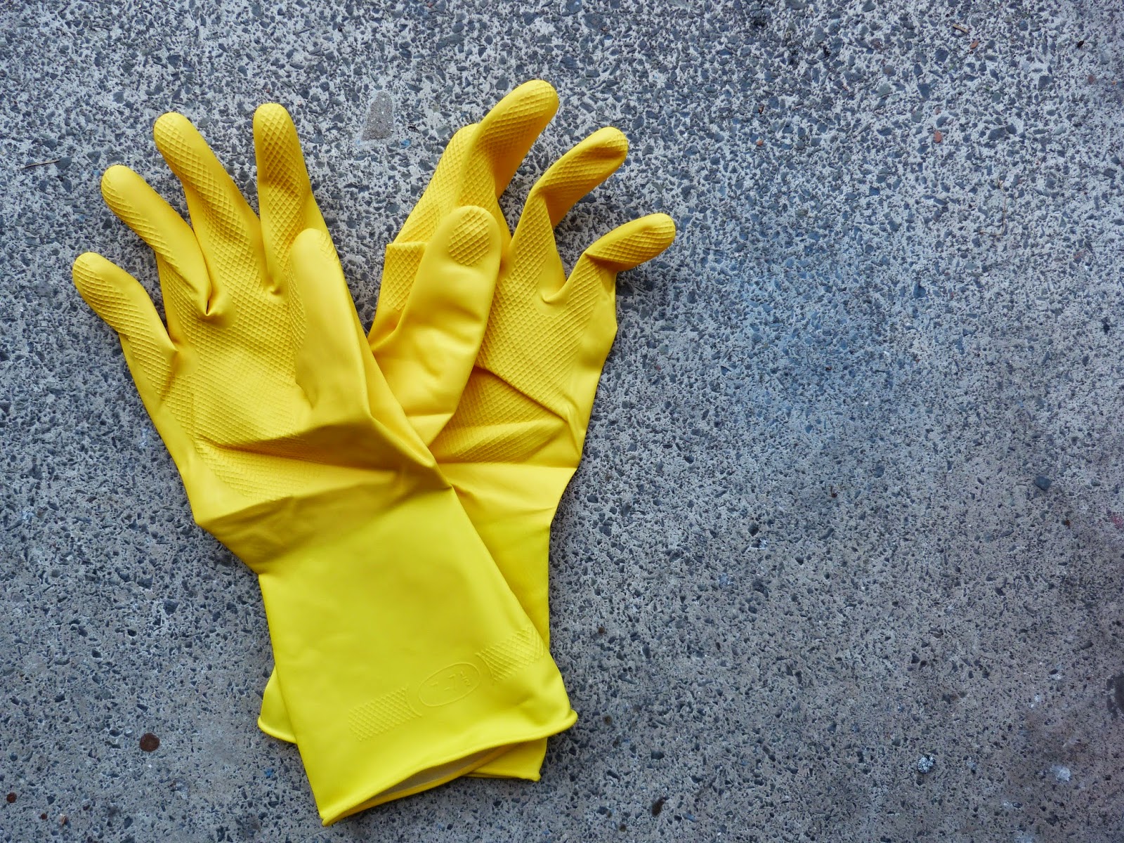
A large part of yesterday afternoon was spent on the balcony.
 
 
Any ideas?
 
 
How about now? 
 
Pretty obvious right?
The end result, I hope, will be some new necklace designs. For now they'll be one off's for the open section of an exhibition at Arts Hub 47 opening this week. The cotton cord, when it's not bound in Tana Lawn as mine usually is, has a really nice drape to it, so I experimented with a few shapes to best highlight this.


First off, I cut the cord to length, and bundled it up so I knew which lengths were for which style. Then it was into a bowl of water to soak through ready to take up the dye...
 ...assisted, as ever, by Catsby. Next up was mixing the colours I wanted. Clothes dye isn't the easiest stuff to mix, it doesn't always do what you expect it to, and it's hard to tell what colour you'll end up with once it's dry. I had Bahama Blue, Sunflower Yellow and Rosewood Red, which I muddled well enough to get a tealy green, an orangey red and a warm yellow.
 
 
Some of the cord went right in to get an all over solid colour, and some of it I half immersed to get an ombre effect along the length, pulling it a bit further out every 5-10 minutes to get the gradient. For one of the designs I did a two colour ombre, starting from either end, like so...
  
I left it all soaking for about an hour then rinsed in cold water, taking care not to bleed the different colours, and then washed in warm water to get the last of the dye out.


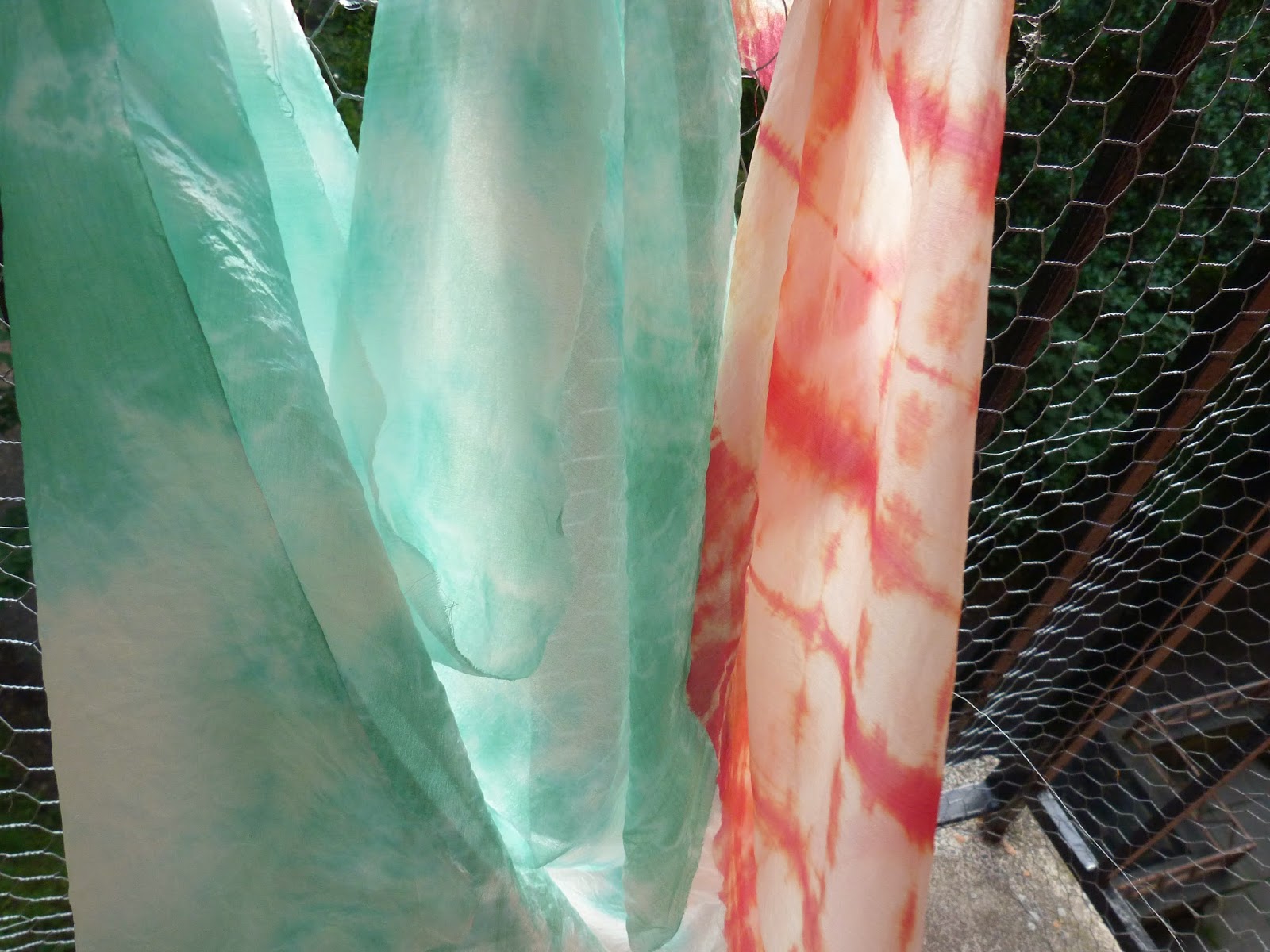
 Whilst they were drying I threw a bit of silk habotai in to see what would happen.
In the teal, scrunched into a ball and tied with elastic bands.
And in the red, concertina pleated along the length, then again in the other direction before being tied.
I will show you the finished necklaces very soon, but in the meantime, here are the dried habotai pieces.


Any suggestions for what I should do with them?

Monday, 19 May 2014

The Lost Lanes

I'm back in the studio after a few weeks away for a costume supervising job. When I went away the trees were still bare, but I returned home to this;
 
 
It's a lot like being in a tree house sometimes, and the constant bird and squirrel traffic outside is a great distraction. My own attempts at greenery aren't going too badly either.
I can't really work out why they have such a heavy leafy plant on top of a pathetically weedy stem, is this normal for Forget-Me-Nots? I'm just going to leave them and see what happens.

But back to business news, I am very pleased to announce that my range of Liberty Knot jewellery is now available to buy from The Lost Lanes!
For a little more about The Lost Lanes, here is a snippet from their Facebook page:
Decadently eclectic, the market place collectively brings together a generous selection of homewares, fashion items, gifts and accessories from all over the country – from established studios to humbler operations – that are refreshingly different, elegantly eccentric and cannot be bought on the high street.

From elaborate print textiles to quirky crockery; statement jewellery to arty oddities – The Lost Lanes carefully curates its collection of products so that discerning design junkies and gift hunters genuinely experience the delight and joy of uncovering a real find every time they visit the website. 
That pretty much sums it up! I'm really pleased to have been asked to join their community and look forward to working with them for the foreseeable future. I really recommend having a wander round the site to see all the fabulous work for yourself, but in the meantime here are some of my favourite pieces, enjoy!
Owl Be Watching You Sweatshirt by Dazzle & Jolt
Lion Cups by Yas-Ming Ceramics
Romeo Rain Cape by SquidLondon
Chief Cougar's 1210S Turntable Necklace by Bug
Equis All Day Satchel - Tan and Brown by Be.Loved

Thursday, 16 January 2014

A Valentines Collection

I've just finished listing a small collection of new pieces especially for Valentine's Day (February 14th in case you were wondering) and yes, you're right, that is my birthday too! How good of you to remember!

I've chosen another version of Capel for these pieces, the bright red one which I've been lusting after for some time now. It's a really true red which works brilliantly for V-Day.

I'm most excited about a couple of new designs I'm trying out, seeing which is most popular before I go into production on my Spring-Summer collection.

Both of them are based on a really simple figure of eight knot, this first one made of four knots in a symmetrical arrangement, suspended from chain either side.

 The second is more like my a-symmetric reef knot necklace, with the two knots extending into a continuous 'collar' which fastens with a clasp at the back.

 Which is your favourite? I'm leaning toward the first design, but I'm easily swayed, I'll definitely be taking one of them into next season's collection, and I've got some exciting new prints lined up for it too, so watch this space!

Friday, 10 January 2014

New Year, New Projects: Traces 2014

Happy New Year to you all, I hope everyone has eaten and drunk to excess and is now begrudgingly back in work! I personally had a rather busy festive period, full of the usual Christmas Fair mania and a some other new ventures that I will tell you about soon... For now, however, I will stick to one exciting event that I am completely thrilled to be a part of .


Straight from their page, because they explain it much better than I ever could;
Traces is an immersive and theatrical multi-disciplinary art & design event inspired by real stories and histories of buildings. Every story, however hidden, leaves a trace… Have you ever wandered through a dilapidated and empty building, wishing you could see it as the last inhabitants left it?
For ten days in February 2014, ‘Traces’ will take a neglected old building and bring it alive again with the smells, tastes, touches and sounds of days gone by. Immersive and theatrical, ‘Traces,’ is a new kind of art and design event, showcasing the work of over 100 artists. Painstakingly researched, it will map and elaborate on the actual stories of the inhabitants of our event’s secret location.
The public are invited to discover these histories for themselves; wandering through the rooms left as if only a moment before, and unpicking their secrets. Interacting with the specially commissioned and selected art and design pieces, to unravel clues about the building and it’s inhabitants, whilst also having the opportunity to buy their favorites at the end of the night.
How amazing does that sound? So while I get to work designing and making my pieces (all top secret of course) Traces HQ will be doing their best to raise the money needed to make the event happen, and that's where you can help! By pledging even just a little bit of money you'll be helping scores of up and coming designers, and the brains behind Traces itself, to get a platform for their work and create a truly memorable experience for everyone involved. There are lots of fun rewards for your pledge too, so take a look at the Kickstarter page to see what's on offer and find out more about the project.

And if you're in London, or could be, then I really recommend following Traces on Twitter to get the clues for the location of the event and get down there for some site-specific, immersive, theatrical, art and design fun!

Monday, 23 September 2013

Back in the Swing of Things

After a month long immersion in the theatre world, followed by my sister's wedding and then a stinking cold, I have emerged on the other side, ploughing ahead with new work. Coming back to a studio with nothing but Christmas decorations in stock and having gotten to the end of all my 'good' fabrics (by no means the end of all my fabrics, that will take a few years yet) was more than a little disconcerting. It reminded me of Phillip Pullman's writing habits;
"I write three pages every day (one side of the paper only). That's about 1100 words. Then I stop, having made sure to write the first sentence on the next page, so I never have a blank page facing me in the morning."
I had come home to the BIGGEST blank page, and it took me bloody ages to write anything on it. For the first week I was just scribbling pictures in the margin and underlining the title 4 or 5 times, and the week after that I'd lost the page under a pile of snotty tissues. Thankfully I had some non-design tasks to get on with over the weekend, workshop planning and so on, which has given me a bit of momentum to get my act together today.

One useful thing I did achieve in my first week back was to choose a palette and shortlist some new prints to choose from for my A/W collection. I started with the colour trend report from Pantone, just so I wasn't trying to narrow down from an infinite selection of colours.
I have a feeling Etsy might reference the Pantone colour reports when they set the front page treasuries so it's a handy thing to keep an eye on. The other source I was working from is a still from a fantastic film by Wes Anderson.
If you haven't seen Moonrise Kingdom yet you really must, and if you have you should go and watch it again! Somewhere between these two things I have found my palette, and after much trawling of the site where I get my Tana Lawn I have chosen my prints.
 This first one is Tatum, a classic Liberty design that I haven't used before, the contrast between the dark purple ground and the acid yellow leaves is nice and fresh without being too summery.
I've been desperate to use Capel for a while now, I thought it would be good to have something a bit more solid in the mix and I think it'll really show off the detail in the knot jewellery.
This is a Betsy Ann, a smaller, less brash version of Betsy, full of nice stormy, autumnal tones.
This is a Claire Aude, another Liberty classic, but in a colour way I haven't used before, it's a bit softer than the other prints with some nice orangey leaf tones in it, I'd agree with my friend JM that it's a bit 1930's, no bad thing!
This last print is Nina Taylor, it's a seasonal design from the A/W 13 collection and was a last minute pick as I was searching for something with a bit more orange in it to tie the whole collection together, which this does perfectly. You should search the Nina Taylor print as there are some other beautiful colour ways available.

So now I'm waiting for everything to arrive before I can get making again, but if you are interested in ordering a piece of jewellery in any of these prints I am now taking orders over on my Facebook page at slightly discounted prices for the next two weeks. Just message my on FB with your contact details, the print you'd like and the style of necklace or bracelet and I can get started on it as soon as everything arrives, and it'll arrive in it's own Handmade by Bunny Bosworth gift box!

Blogging tips