Showing posts with label colour. Show all posts
Monday, 30 June 2014
Thursday, 16 January 2014
A Valentines Collection
I've just finished listing a small collection of new pieces especially for Valentine's Day (February 14th in case you were wondering) and yes, you're right, that is my birthday too! How good of you to remember!
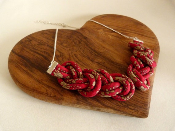
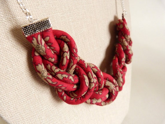
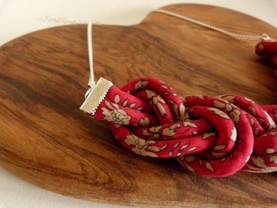
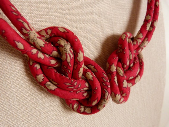
I've chosen another version of Capel for these pieces, the bright red one which I've been lusting after for some time now. It's a really true red which works brilliantly for V-Day.
I'm most excited about a couple of new designs I'm trying out, seeing which is most popular before I go into production on my Spring-Summer collection.
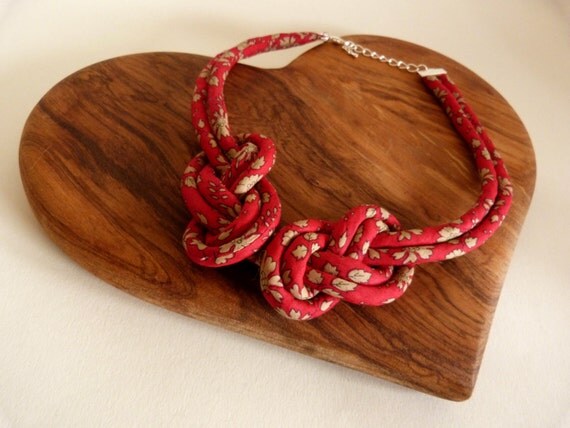
Both of them are based on a really simple figure of eight knot, this first one made of four knots in a symmetrical arrangement, suspended from chain either side.
Which is your favourite? I'm leaning toward the first design, but I'm easily swayed, I'll definitely be taking one of them into next season's collection, and I've got some exciting new prints lined up for it too, so watch this space!
I've chosen another version of Capel for these pieces, the bright red one which I've been lusting after for some time now. It's a really true red which works brilliantly for V-Day.
I'm most excited about a couple of new designs I'm trying out, seeing which is most popular before I go into production on my Spring-Summer collection.
Both of them are based on a really simple figure of eight knot, this first one made of four knots in a symmetrical arrangement, suspended from chain either side.
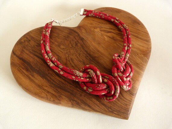
The second is more like my a-symmetric reef knot necklace, with the two knots extending into a continuous 'collar' which fastens with a clasp at the back.
Labels:
Capel,
colour,
design,
etsy,
February 14th,
knots,
Liberty,
love,
prints,
research,
retail,
Tana Lawn,
Valentines Day
Monday, 23 September 2013
Back in the Swing of Things
After a month long immersion in the theatre world, followed by my sister's wedding and then a stinking cold, I have emerged on the other side, ploughing ahead with new work. Coming back to a studio with nothing but Christmas decorations in stock and having gotten to the end of all my 'good' fabrics (by no means the end of all my fabrics, that will take a few years yet) was more than a little disconcerting. It reminded me of Phillip Pullman's writing habits;
I had come home to the BIGGEST blank page, and it took me bloody ages to write anything on it. For the first week I was just scribbling pictures in the margin and underlining the title 4 or 5 times, and the week after that I'd lost the page under a pile of snotty tissues. Thankfully I had some non-design tasks to get on with over the weekend, workshop planning and so on, which has given me a bit of momentum to get my act together today.
One useful thing I did achieve in my first week back was to choose a palette and shortlist some new prints to choose from for my A/W collection. I started with the colour trend report from Pantone, just so I wasn't trying to narrow down from an infinite selection of colours.
I have a feeling Etsy might reference the Pantone colour reports when they set the front page treasuries so it's a handy thing to keep an eye on. The other source I was working from is a still from a fantastic film by Wes Anderson.
If you haven't seen Moonrise Kingdom yet you really must, and if you have you should go and watch it again! Somewhere between these two things I have found my palette, and after much trawling of the site where I get my Tana Lawn I have chosen my prints.
This first one is Tatum, a classic Liberty design that I haven't used before, the contrast between the dark purple ground and the acid yellow leaves is nice and fresh without being too summery.
I've been desperate to use Capel for a while now, I thought it would be good to have something a bit more solid in the mix and I think it'll really show off the detail in the knot jewellery.
So now I'm waiting for everything to arrive before I can get making again, but if you are interested in ordering a piece of jewellery in any of these prints I am now taking orders over on my Facebook page at slightly discounted prices for the next two weeks. Just message my on FB with your contact details, the print you'd like and the style of necklace or bracelet and I can get started on it as soon as everything arrives, and it'll arrive in it's own Handmade by Bunny Bosworth gift box!
"I write three pages every day (one side of the paper only). That's about 1100 words. Then I stop, having made sure to write the first sentence on the next page, so I never have a blank page facing me in the morning."
One useful thing I did achieve in my first week back was to choose a palette and shortlist some new prints to choose from for my A/W collection. I started with the colour trend report from Pantone, just so I wasn't trying to narrow down from an infinite selection of colours.
I have a feeling Etsy might reference the Pantone colour reports when they set the front page treasuries so it's a handy thing to keep an eye on. The other source I was working from is a still from a fantastic film by Wes Anderson.
If you haven't seen Moonrise Kingdom yet you really must, and if you have you should go and watch it again! Somewhere between these two things I have found my palette, and after much trawling of the site where I get my Tana Lawn I have chosen my prints.
This first one is Tatum, a classic Liberty design that I haven't used before, the contrast between the dark purple ground and the acid yellow leaves is nice and fresh without being too summery.
I've been desperate to use Capel for a while now, I thought it would be good to have something a bit more solid in the mix and I think it'll really show off the detail in the knot jewellery.
This is a Betsy Ann, a smaller, less brash version of Betsy, full of nice stormy, autumnal tones.
This is a Claire Aude, another Liberty classic, but in a colour way I haven't used before, it's a bit softer than the other prints with some nice orangey leaf tones in it, I'd agree with my friend JM that it's a bit 1930's, no bad thing!
This last print is Nina Taylor, it's a seasonal design from the A/W 13 collection and was a last minute pick as I was searching for something with a bit more orange in it to tie the whole collection together, which this does perfectly. You should search the Nina Taylor print as there are some other beautiful colour ways available.
So now I'm waiting for everything to arrive before I can get making again, but if you are interested in ordering a piece of jewellery in any of these prints I am now taking orders over on my Facebook page at slightly discounted prices for the next two weeks. Just message my on FB with your contact details, the print you'd like and the style of necklace or bracelet and I can get started on it as soon as everything arrives, and it'll arrive in it's own Handmade by Bunny Bosworth gift box!
Subscribe to:
Posts (Atom)